Octobank, Digital Microloans
February 2025 – December 2025
In 2025, I joined Octobank as a Lead Product Designer to build the digital lending direction after the bank’s rebranding. I created the mobile app, design system, and key lending experiences from scratch for customers in Uzbekistan.
Business Goal
Enter the top 3 banks in Uzbekistan by launching competitive digital lending products.
Launch one of the first refinancing products on the market to attract new customers.
Increase digital loan adoption and reduce operational costs through automation.
Build a scalable design system and product foundation for future banking services.
Role & Team
Role: Lead Product Designer (Credit Products & Banking Design System).
Cross-functional product team: 2 iOS Developers, 2 Android Developers, 2 Backend Developers, 2 System Analysts, 2 Business Analyst, Product Manager and 2 QA Engineers.
Challenges
Build a mobile banking experience from zero in a new market.
Establish a scalable design system to support future product growth.
Understand local customer needs, behaviors, and financial habits.
Design solutions within significant technical limitations.
Deliver a full product launch under aggressive timelines.
Micro-loan
In the Uzbekistan market, "Micro-loans" is one of the most popular lending products — a simple way to quickly get money for a purchase, car repair, or tuition payment.
As part of the MVP for the lending direction, this product became the primary focus. The task was to design the entire micro-loan application flow — from calculating the loan amount to money being credited to the card — with a minimal number of steps, while meeting the requirements of the Central Bank of Uzbekistan.
Benchmarking
Goal: study competitor solutions for loan calculators and application forms to identify best practices and growth opportunities for the product.
Key findings: landing page structures across competitors were largely similar, with the main differences in how loan calculators were implemented. Yandex Pay's solution stood out the most — a fresh, minimalist approach with a convenient one-screen scenario that could serve as a reference.

User Interviews
Goal: identify the problems users face when applying for a micro-loan at other banks, and what matters most to them.
Key insights: most clients value speed and simplicity above all. The number of steps in the form needed to be minimized, keeping only the key fields required to complete the process quickly.

Hypotheses
Loan calculation block. Users can quickly find the calculated loan parameters pinned to the bottom of the screen.
Landing page information. Users have enough information to understand the loan terms, application steps, and submit a request.
Entry point. Users can easily find the product showcase, even if they already have an active loan.
Application length. The form doesn't feel overloaded, and the number of fields doesn't prevent users from completing it.
Metrics and How to Influence Them
Conversion to Application. Add a clear CTA right after the calculation, showing the benefit (amount, rate, monthly payment).
Calculator CTR. Avoid overloading the calculation page, and make the CTA clearly visible.
Time to Complete. Minimize the number of clicks and fields in the application. Support autofill, smooth field-switching with the keyboard open, and reduce the total number of fields.
Drop-off Rate by step. Remove optional fields, add a step-by-step progress indicator, and highlight errors clearly.
Approval Rate / Take Rate. Verify data collection accuracy, add hints for error correction, and integrate scoring early in the flow.
User Flow
Based on the interviews and hypotheses, a Jobs-to-be-Done framework was defined and the core user scenario was designed.

First Prototype and Usability Testing
Results:
Most respondents praised the scenario and the ease of the calculation step.
Some flagged unnecessary fields, such as a second contact person and an additional phone number.
Respondents noted they'd like to see a brief overview of the upcoming steps.

Final Design and Repeat Usability Testing
Based on the initial research and feedback collected, the prototype was refined and the final version assembled. It was sent for repeat usability testing before moving into development.

Entry point from the home screen and products screen.
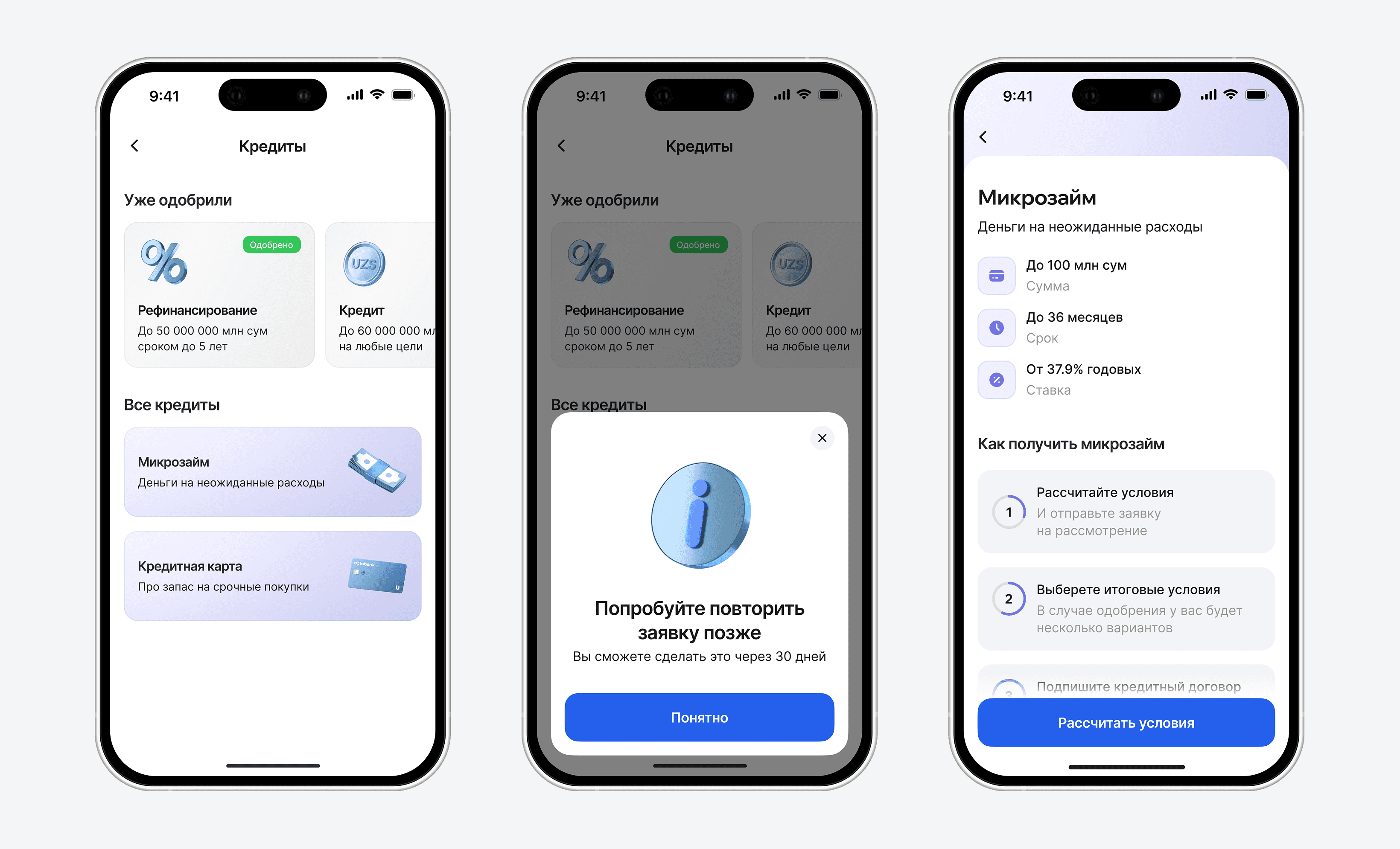
Entry point from the products screen, and the landing page for the micro-loan program.

Loan calculation and application submission.

Final approval and confirmation of selection.

Card selection for disbursement, and acceptance of all agreements.

Contract signing via SMS code, followed by the final success screens. New clients go through call center verification; returning clients (with a prior loan) proceed directly to funds disbursement.
Loan management
The mobile app lacked any post-disbursement experience. I designed the entire loan management flow from scratch, enabling customers to make repayments, view payment schedules, request certificates, and access key loan information. The solution was informed by benchmarking leading banking products in Russia and Uzbekistan.

Loan Overview & Management.

Partial Loan Repayment.